While doing our GRE Preparation, we mostly focus on broader sections like Verbal Reasoning and Quantitative Reasoning. However, each of those sections has very critical subsections. One of them is the GRE Data Interpretation questions or Data Analysis- a subpart of Quantitative Reasoning.
This is a crucial section, you can expect at least 6 questions in your GRE Quantitative reasoning from this. However, what makes the section more critical is that probably this is the first time many of you will be interacting with this question type.
What is the GRE Data Interpretation Section all about?
Data Interpretation assesses your capability to make sense of the data given, draw conclusions from them, and find out the required result. Unlike other questions, data interpretation questions will come in a set format. There will be a block of information given, followed by 3 questions all related to that block.
DI questions might not be present in both the Quantitative sections, but at least one of them will have such questions. Now, the data given can be in any format- bar chart, graphical method, pie chart, histogram, table, etc. While all of this might sound confusing, the process is simple.
You just have to make sense of what is given in the table/ graph/ chart format. The questions asked about them are very rudimentary. However, keep in mind that data interpretation questions are calculation-intensive and hence time-consuming.
Why does the GRE give DI questions?
The GRE is primarily an aptitude and speed test. It doesn't check any complex technical concepts like the GATE or AIEEE, rather it checks your ability to think and solve fast, your understanding of the fundamental concepts, and cognitive skills. This is where the data interpretation questions come in.
The ability to make sense of random information or data is very crucial for succeeding in graduate schools, especially for masters, because you are supposed to do a lot of readings, research, and calculations for your courses. Beyond this, learning how to interpret data also teaches you another skill- how to present data.
While doing your master's, in your exam presentations, or while defending your thesis, you have to present your findings to the faculty and other jury members. And mostly, that will involve a lot of data. Showing that data in a visual format through charts and graphs, rather than talking about it, is the smart way to go.
Types of Data Interpretation questions in the GRE
1. Pie Chart
One of the most common types of Data Interpretation questions in the GRE, pie charts break down the information in percentages or sectors, or proportions. Every pie chart may contain multiple pies.
Let us illustrate this with an example :
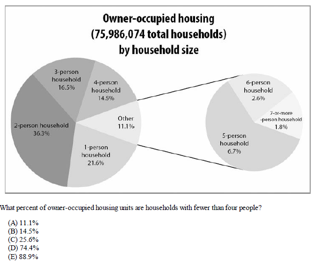
This pie chart represents about 76 million owner-occupied housing units, categorized by how many people live in the household. Don’t let the smaller pie chart on the right throw you off. It is just a way to “zoom in” on the relatively small categories of households with at least 5 people.
These categories could have been shown as small slivers in the pie chart on the left (notice that 6.7% + 2.6% + 1.8% = 11.1%, the “Other” category in the chart on the left). So for this question, Sum the households with one, two, or three people (i.e., “fewer than four people”). Together these account for 21.6% + 36.3% + 16.5% = 74.4% of the total.
2. Tables
The second most popular question type and probably one of the easiest ones. You will have a table with columns representing different types of information and rows representing the number/count of variables present.
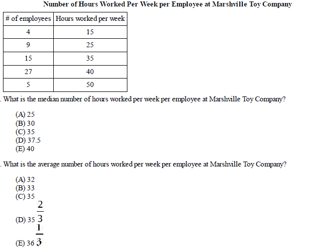
This chart shows the frequency with which certain values — numbers of hours worked per week — appear. That is, the chart is a short way of showing a list of values that would begin: 15, 15, 15, 15, 25, 25, 25, 25, 25, 25, 25, 25, 25… (then the number 35 fifteen times, then the number 40 twenty-seven times, then the number 50 five times). Add the numbers in the lefthand column to determine that 60 people’s work hours are being accounted for.
For the first answer, the median of any list is the middle number or the average of the two middle numbers. However, you CANNOT assume that the middle number in the list 15, 25, 35, 40, and 50 is the median number of hours worked per week because this does not take into account the frequency with which each of those numbers occurs in the list. To find the median, add the numbers of employees: 4 + 9 + 15 + 27 + 5 = 60.
Thus, the middle of this list will be the average of the 30th and 31st values. Since 4 + 9 + 15 = 28, the 29th, 30th, 31st, etc. values fall into the next highest group — the group of 27 people who work 40 hours per week. The median number of hours worked per week per employee is 40.
For the second answer, To average the number of hours worked per week, you CAN NOT simply average 15, 25, 35, 40, and 50. You must take into account how many people work each of those numbers of hours. That is, you must average the values for all 60 workers.
3. Column Chart
Column charts are also called bar charts, and on the GRE paper, they may be referred to as either.
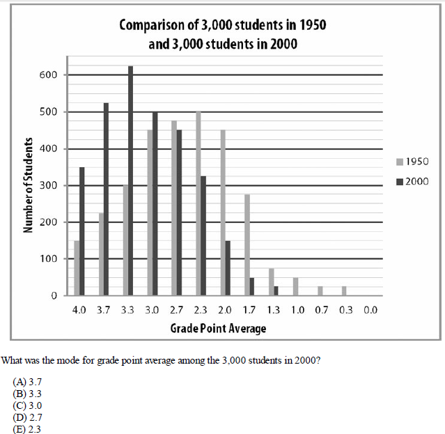
The dark gray bars indicate the number of students in 2000, and the light gray bars indicate the number of students in 1950. Note the general contrast between students in the two years. Connecting the top of each light gray bar with a smooth line, the result would be a sort of bell curve that peaks at a grade point average of 2.3.
Similarly, the dark gray bars form a similar bell curve, but its peak is at a grade point average of 3.3, so the grades, in general, are clustered at the higher end of the scale in 2000.
4. Line Chart
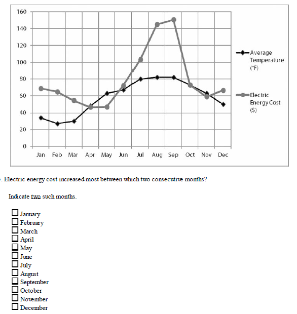
The vertical number scale on the left side of the graph applies to both data sets. For Average temperature, the units are °F and for Electric Energy Cost the units are dollars ($). For example, in January the average temperature was between 30°F and 40°F and the electric energy cost was about $70. Be careful to read data from the correct set. Consult the key frequently, and double-check your answers.
Electric energy cost is represented by the light gray line and circular data points. A cost increase from one month to the next would mean a positive slope for the line segment between the two circular data points. The greater the slope of the light gray line segment, the greater the cost increase between those two months. There was an increase each month between May and September and again between November and December.
But the steepest positive slope is between July and August. The cost increase from July to August was approximately $145 - $103 = $42. For comparison, the cost increase from June to July was only about $103 - $70 = $33. The correct answers are July and August.
5. Mixed Plots
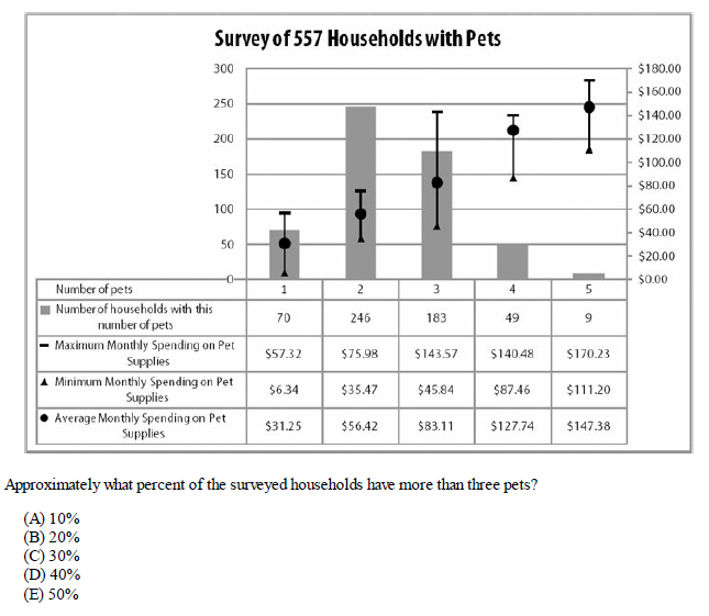
The table tallies the number of households, according to the number of pets in the household. Each column captures information about these households. For example, the leftmost column with numbers indicates that 70 households have 1 pet. You can also say these households spend an average of $31.25 per month on pet supplies. In that group, the household(s) that spent the least spent $6.34 on pet supplies, while the household(s) that spent the most spent $57.32. Notice that the bars and the max/min/average range lines duplicate the information in the table. For exact calculations, rely on the chart numbers.
For broader questions, such as “Which is greater,” the more visual representation of the data can often provide a quick answer. There are 557 households, of which 49 have four pets and 9 have five pets. Thus a total of 58 households have more than three pets.
To express this as a percent, take this number and divide it by the total number of households. 58/557 = 10% (approximately) These are the major Data Interpretation Question types you will get in the GRE. The key to scoring well is more practice. DI questions are easy. It is doing them in the stipulated time that is tricky.
Start practicing Data Interpretation questions from the GREKing Free Practice Ebooks and consult with your mentors for clearing doubts and aim for good GRE scores.
All the best!!!
How Many Practice Tests Should I Take Before the GRE?
How helpful did you find this article?
Thanks for the feedback! Your rating helps us improve future digests.
